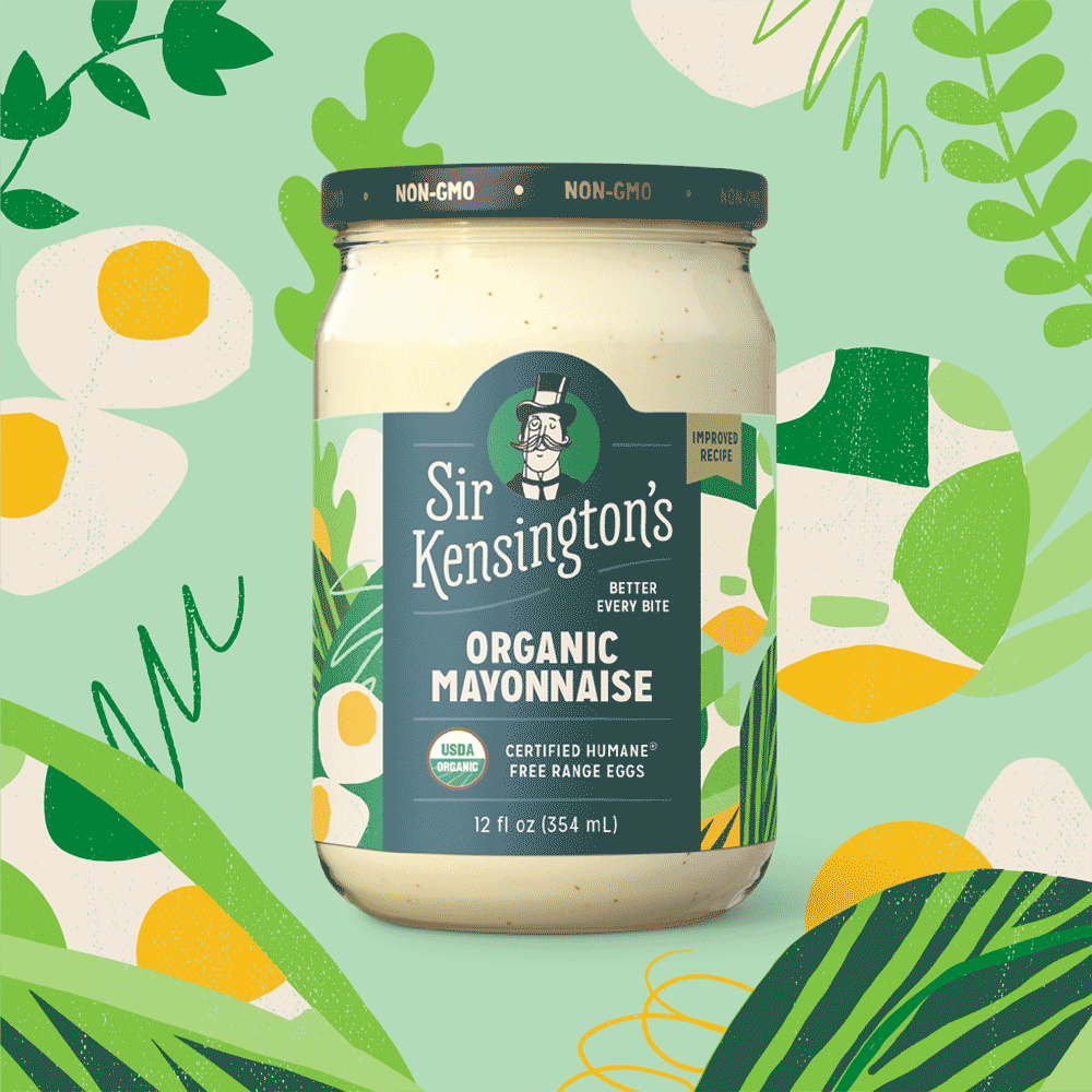
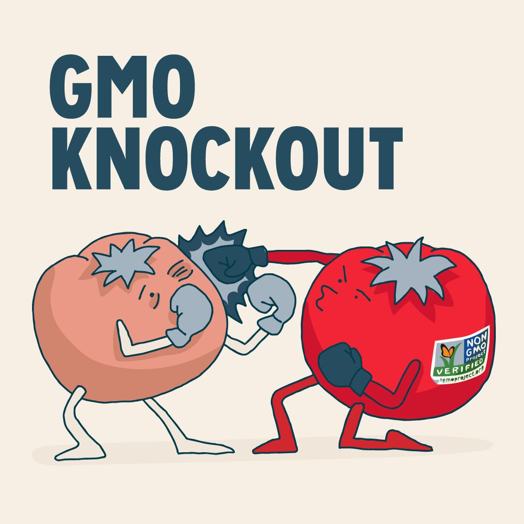
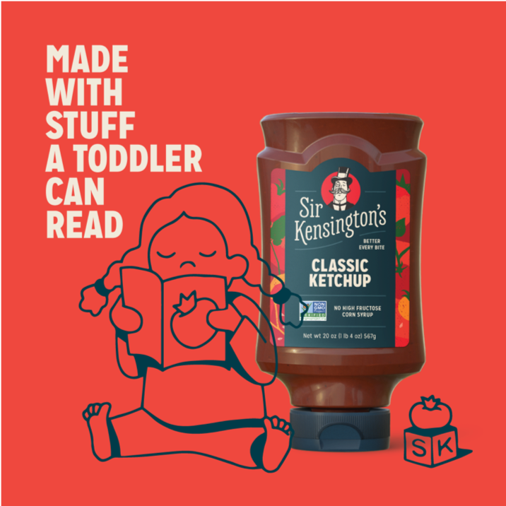
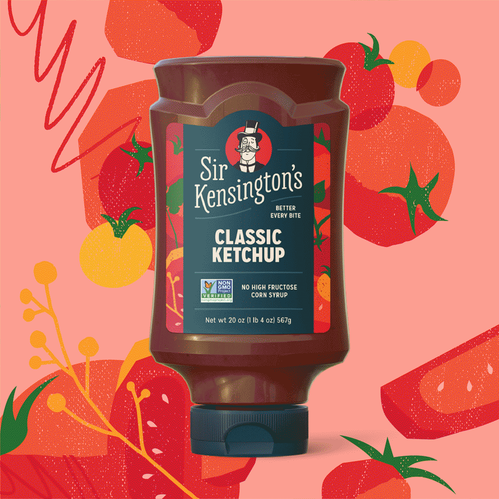
Better Every Bite.
Hand-drawn illustrations: Each product features a playful, custom-made illustration depicting its key ingredients, adding a touch of personality and storytelling.
Bold typography: A unique, hand-lettered typeface reinforces the brand's handcrafted and artisanal approach.
Vibrant color palette: A shift from muted earthy tones to a brighter, more eye-catching spectrum reflects the brand's youthful energy and flavor combinations.
Emphasis on natural textures: Uncoated paper and tactile finishes, like embossed elements or foil accents, convey the use of real ingredients and premium quality.
Client
Sir Kensington’s
Year
2022
Role
Art Direction, Illustration, Graphic Design